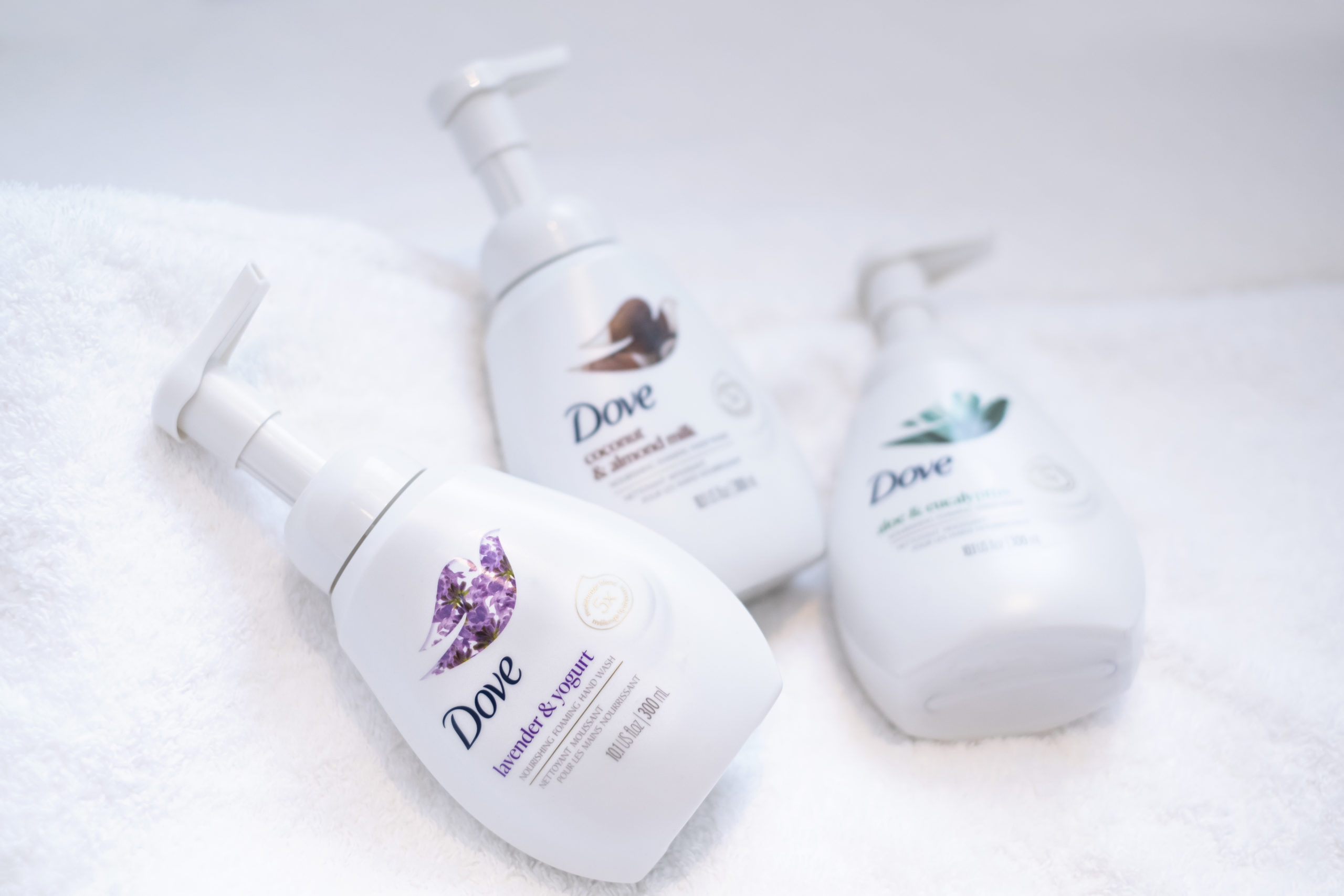
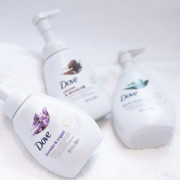
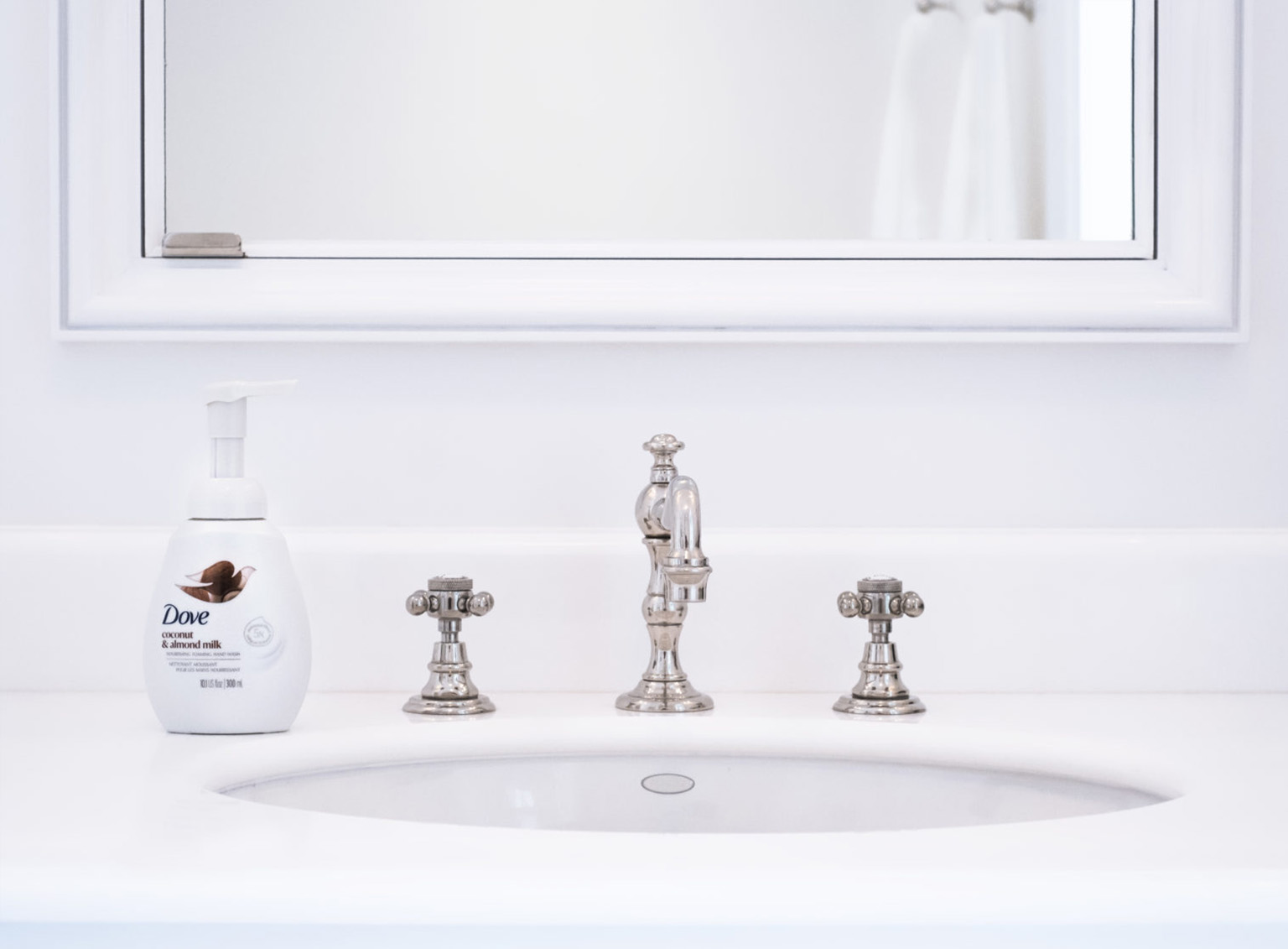
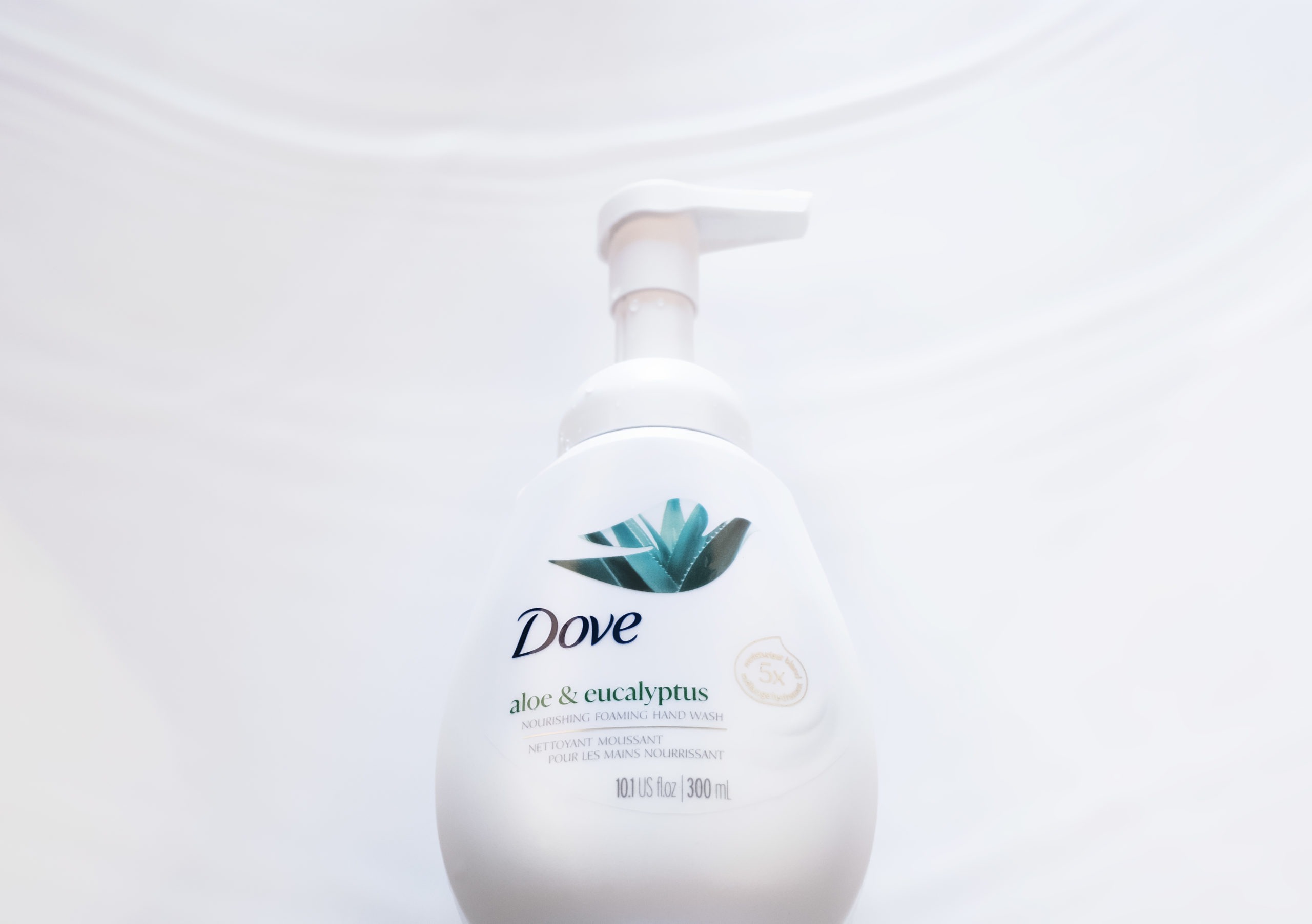
The Dove team came to us to redesign the packaging of their premium foaming hand wash range. Our challenge: enhance the experience, the care, and convey the lusciousness of the ingredients’ product texture and richness through elegant, impactful, and exciting new graphics in a pack that you will be proud to display on your sink.
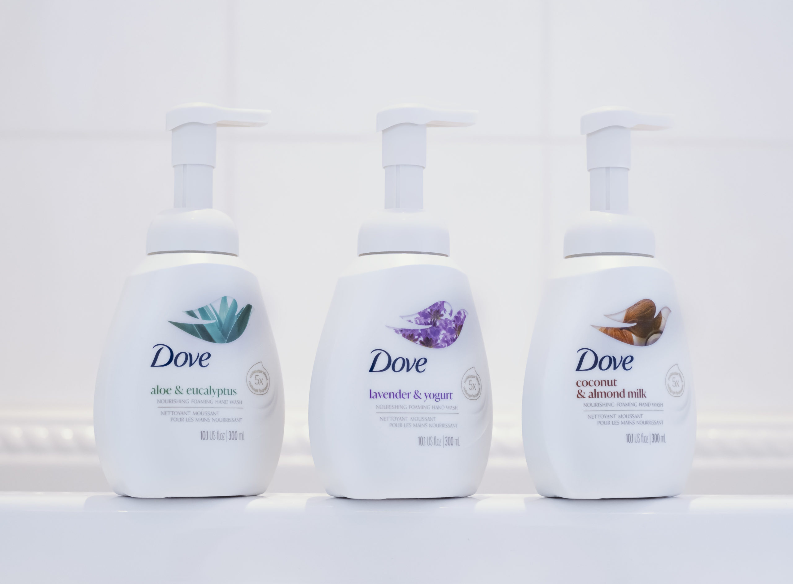
With a design that successfully stands out on shelf, the new Dove Foaming hand wash tells the story of a unique and superior formula. The predominantly white layout, an uncompromisable trait of the Dove brand, conveys the superior care attributes, enhanced with integrating the “5x more moisturizer” claim, efficiently emphasizing the moisturizing benefit. The product texture softly frames the icon, a nod to the rich foam formula loved by the consumers.
The redesign also introduces a new way to celebrate the Dove branding, leveraging the Bird icon and using it as a messenger of goodness and a rich experience. The Dove provides a window to the heart of the product, giving us a glimpse of the rich ingredient stories for each variant, a pleasurable experience every time you wash your hands.


