Espolon Visual Identity

Master Distiller Cirilo Oropeza spent decades learning both the science of distillation and the art of tequila making. His passion for it, matched with his strict attention to detail, allowed Cirilo to dedicate himself to the dream of creating a tequila of great quality that everyone could enjoy. In 1995 he met a local entrepreneur who shared his ambition. They formed a partnership which enabled the creation of a state-of-the-art home for this dream tequila.

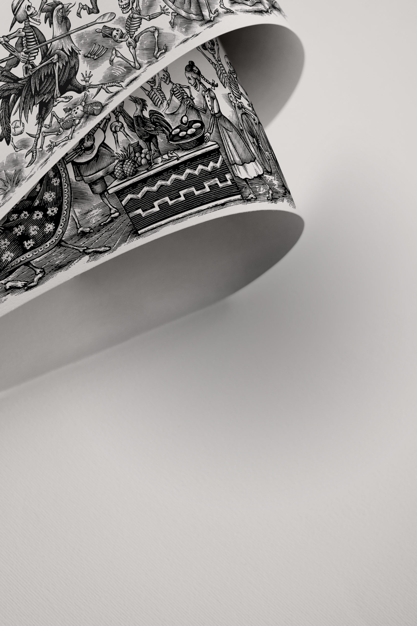
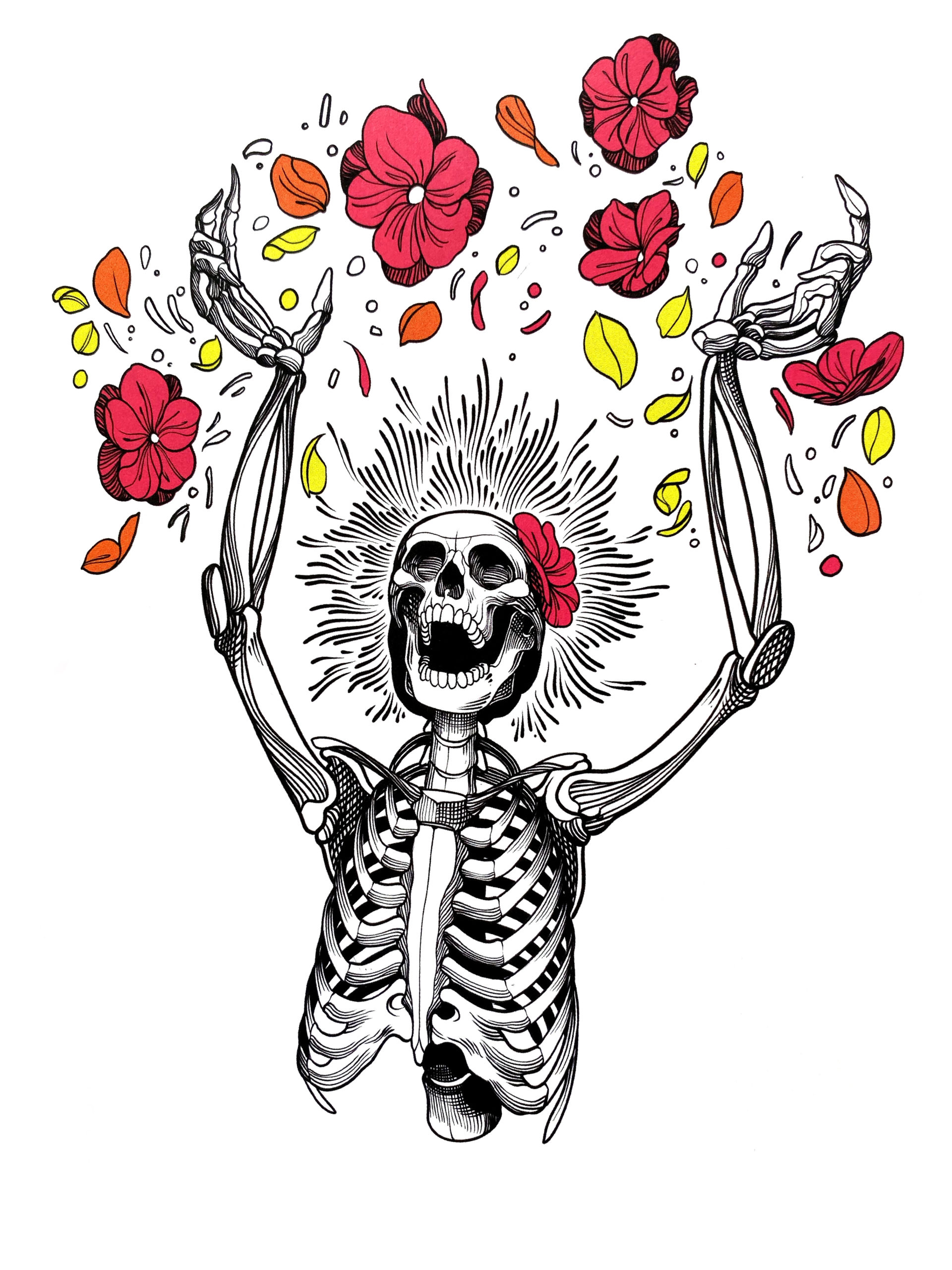
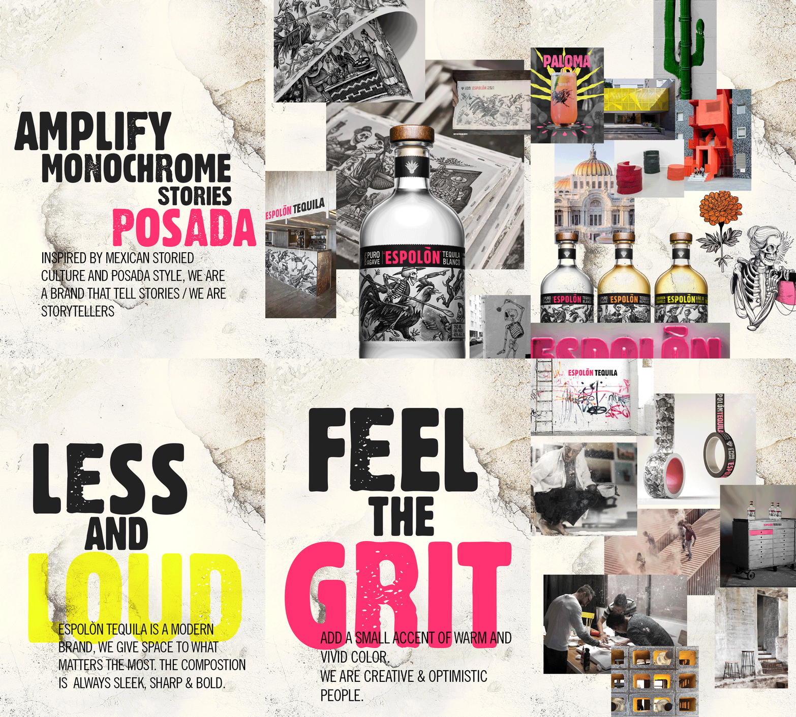
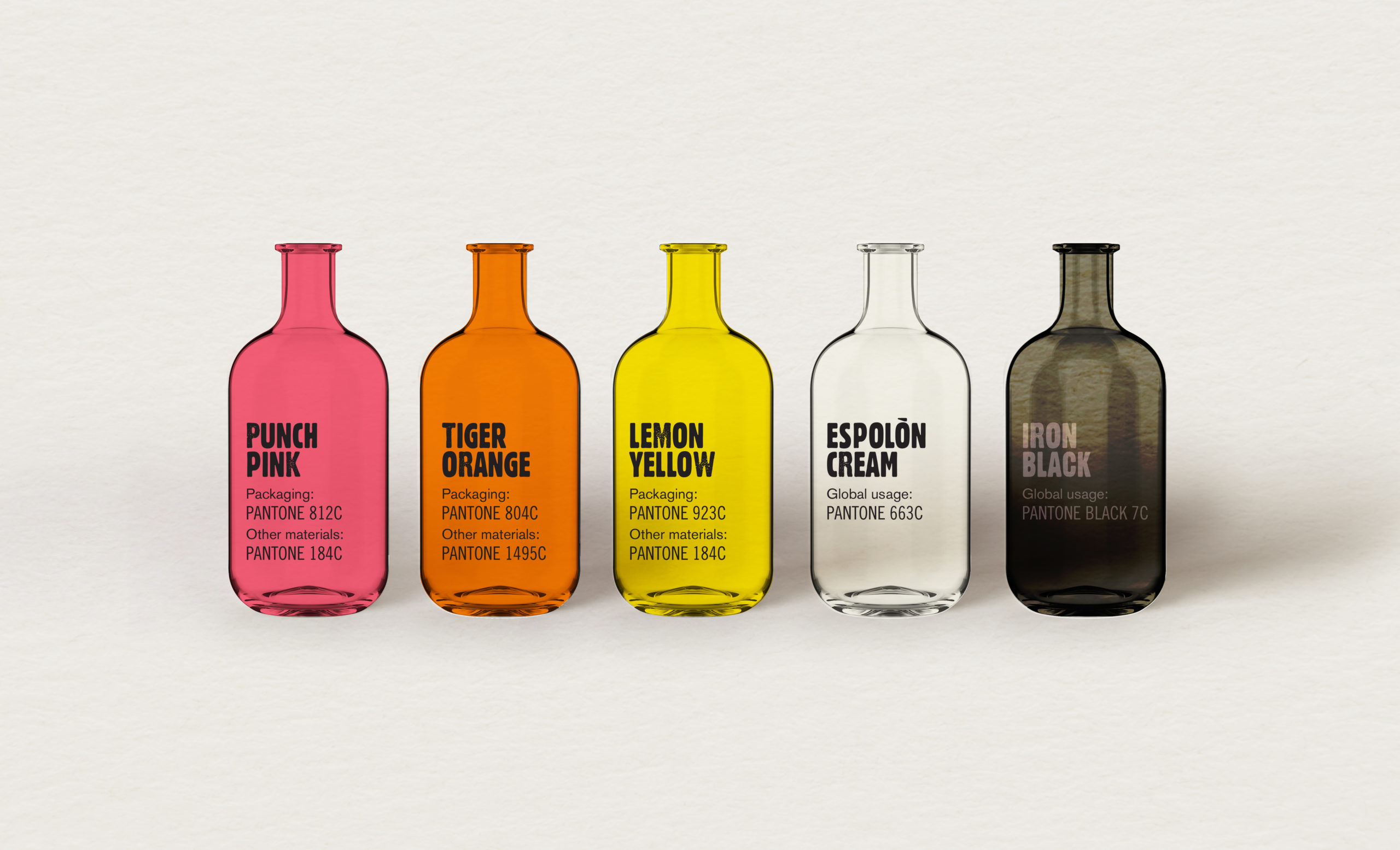
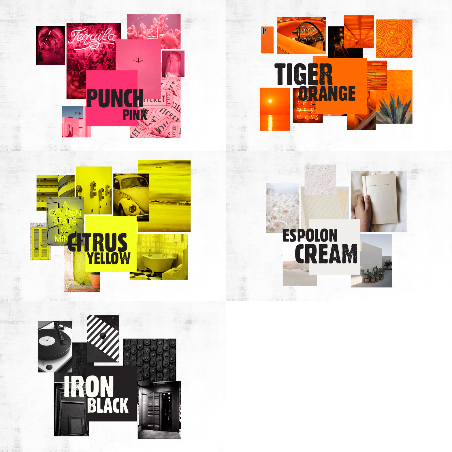
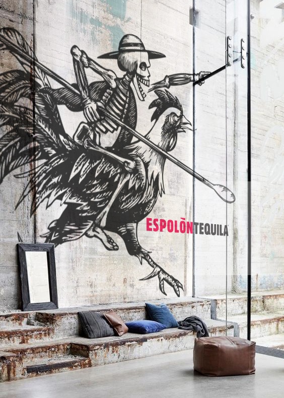
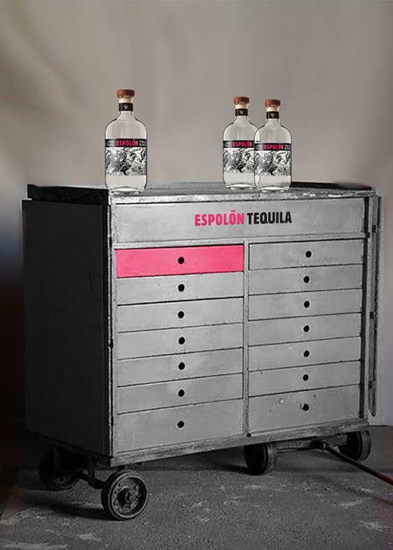
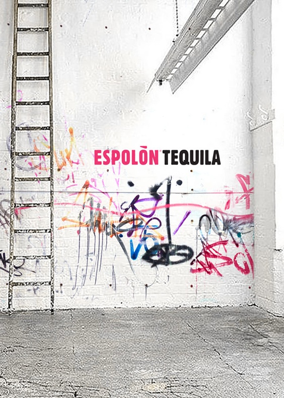
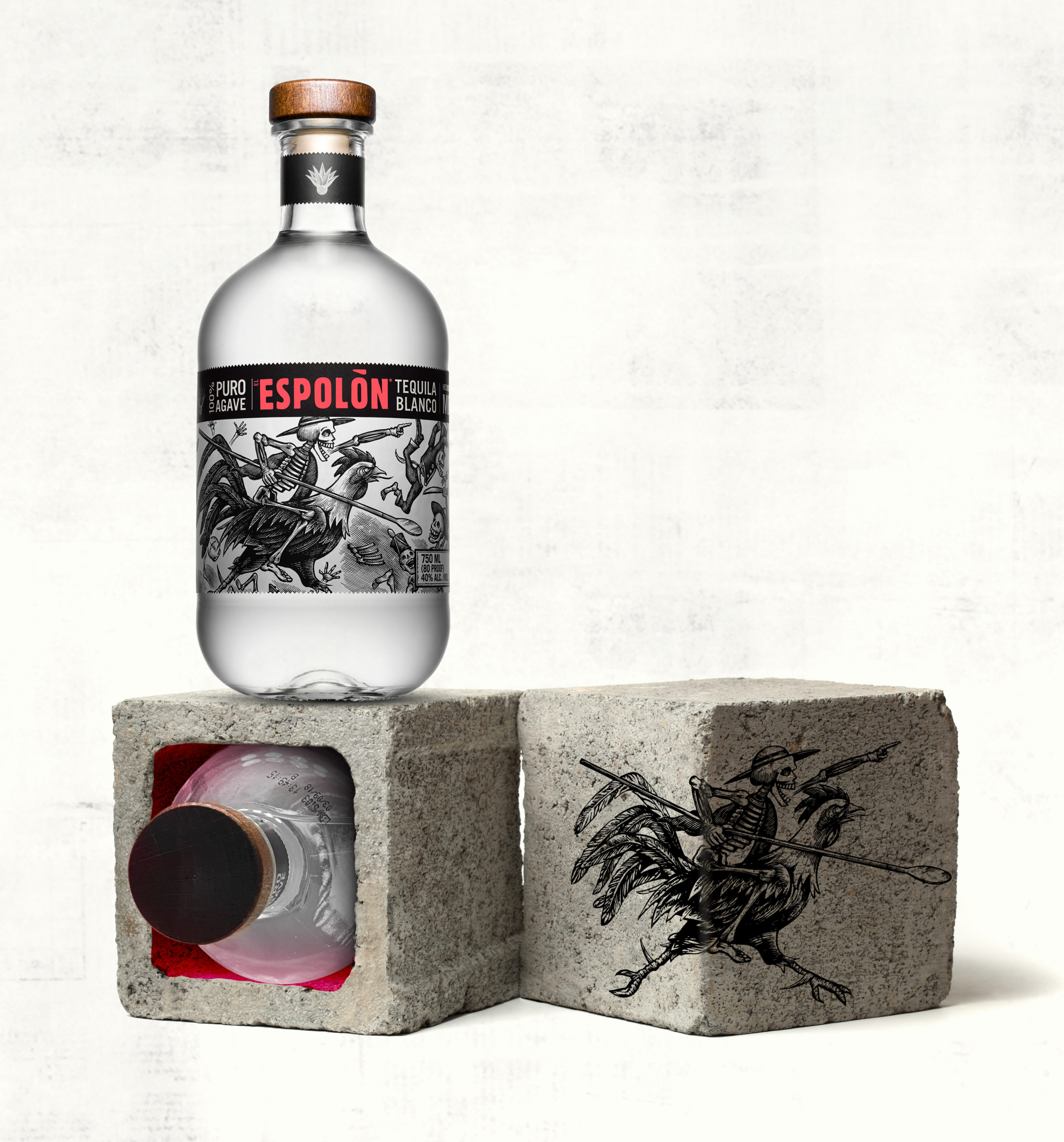
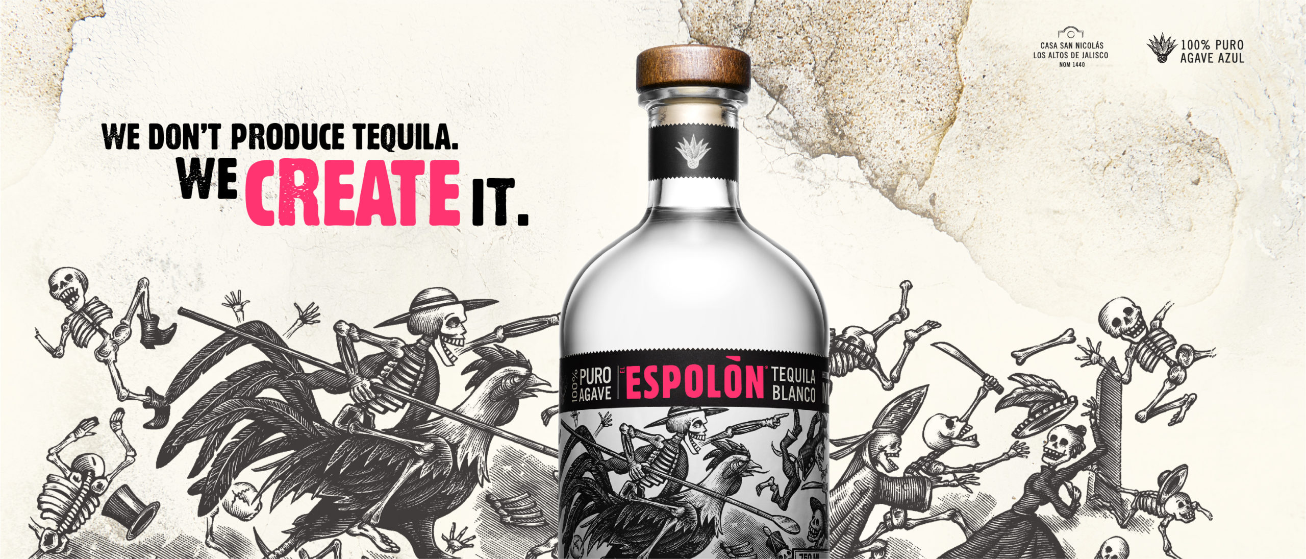
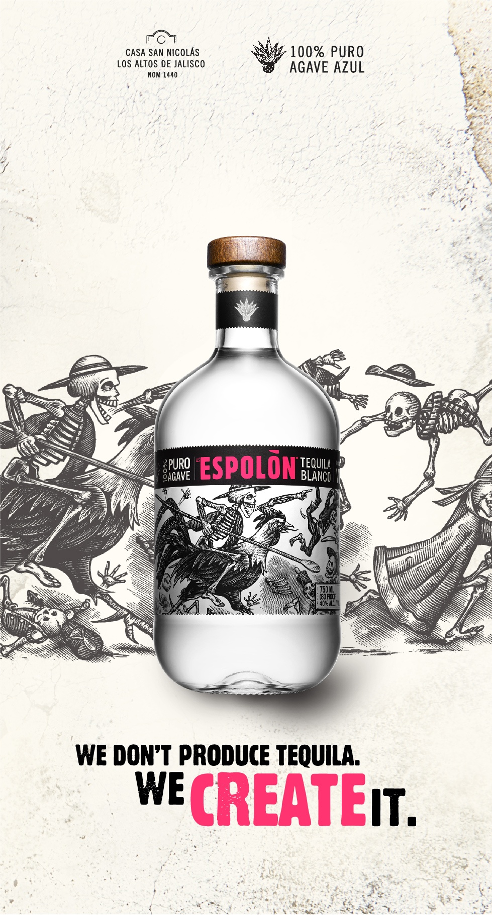
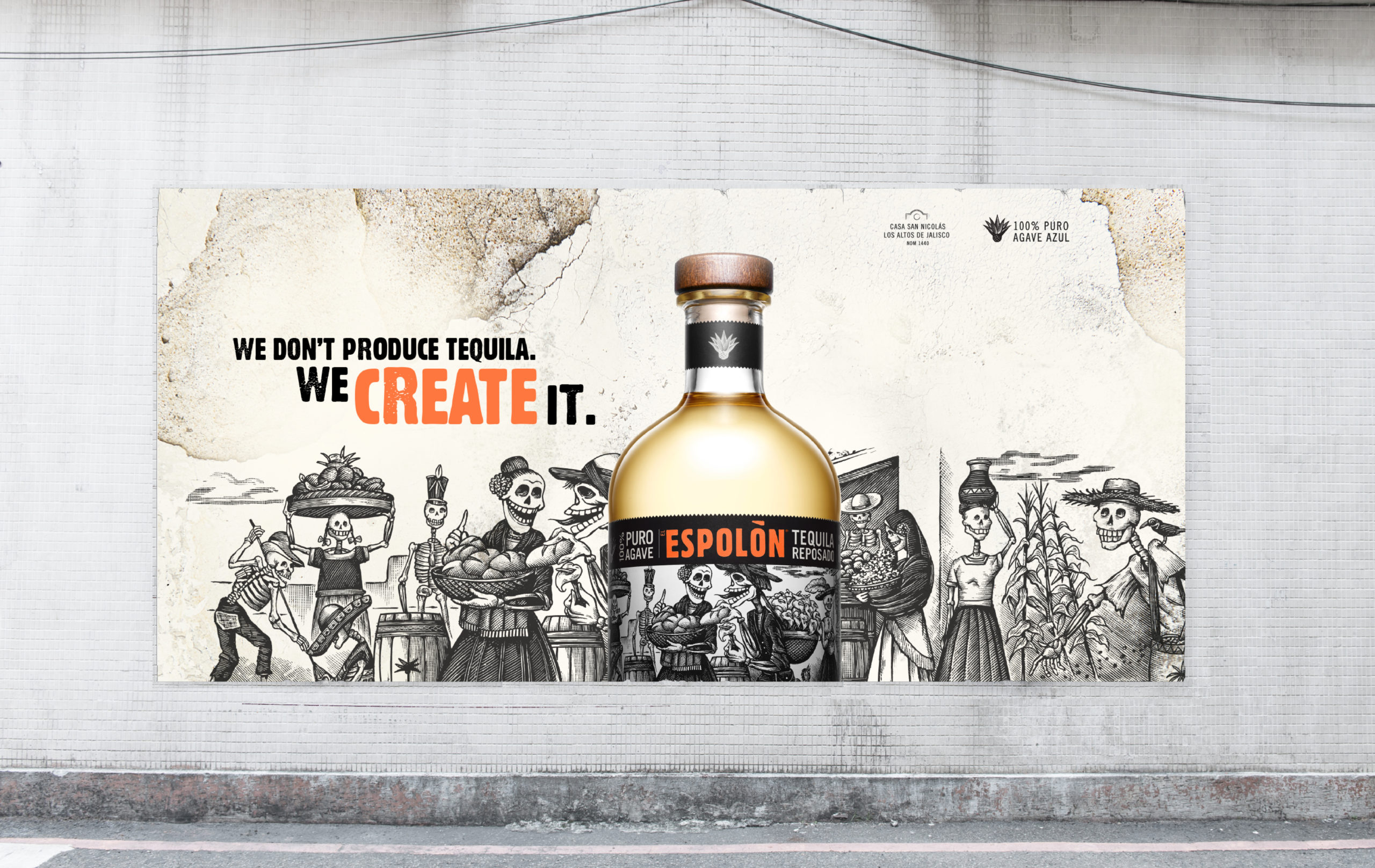
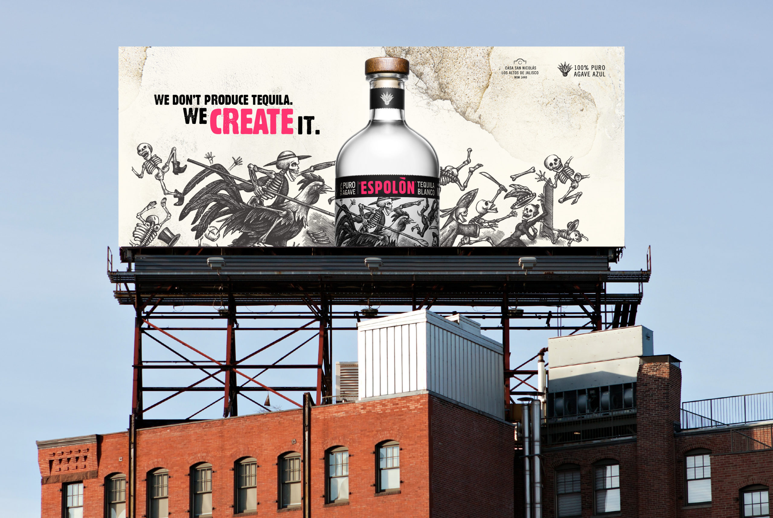
Espolòn Tequila commissioned us to develop their Brand World. Our mission was to bring consistency to the existing assets of the brand, which were already beautiful, to elevate Espolòn Tequila to the premium status it deserves. Our campaign signature “We don’t produce tequila, we create it” is a tribute to Cirilo’s pioneering spirit and commitment to his art. The art direction is guided by four main design principles: amplified monochrome posada, add a pop of colour, less and loud and feel the grit. Espolòn is a modern brand inspired by Mexican storied culture and posada style. The brand lives in a raw and unpolished creative environment where you are part of the creative process in real time, with no filter.

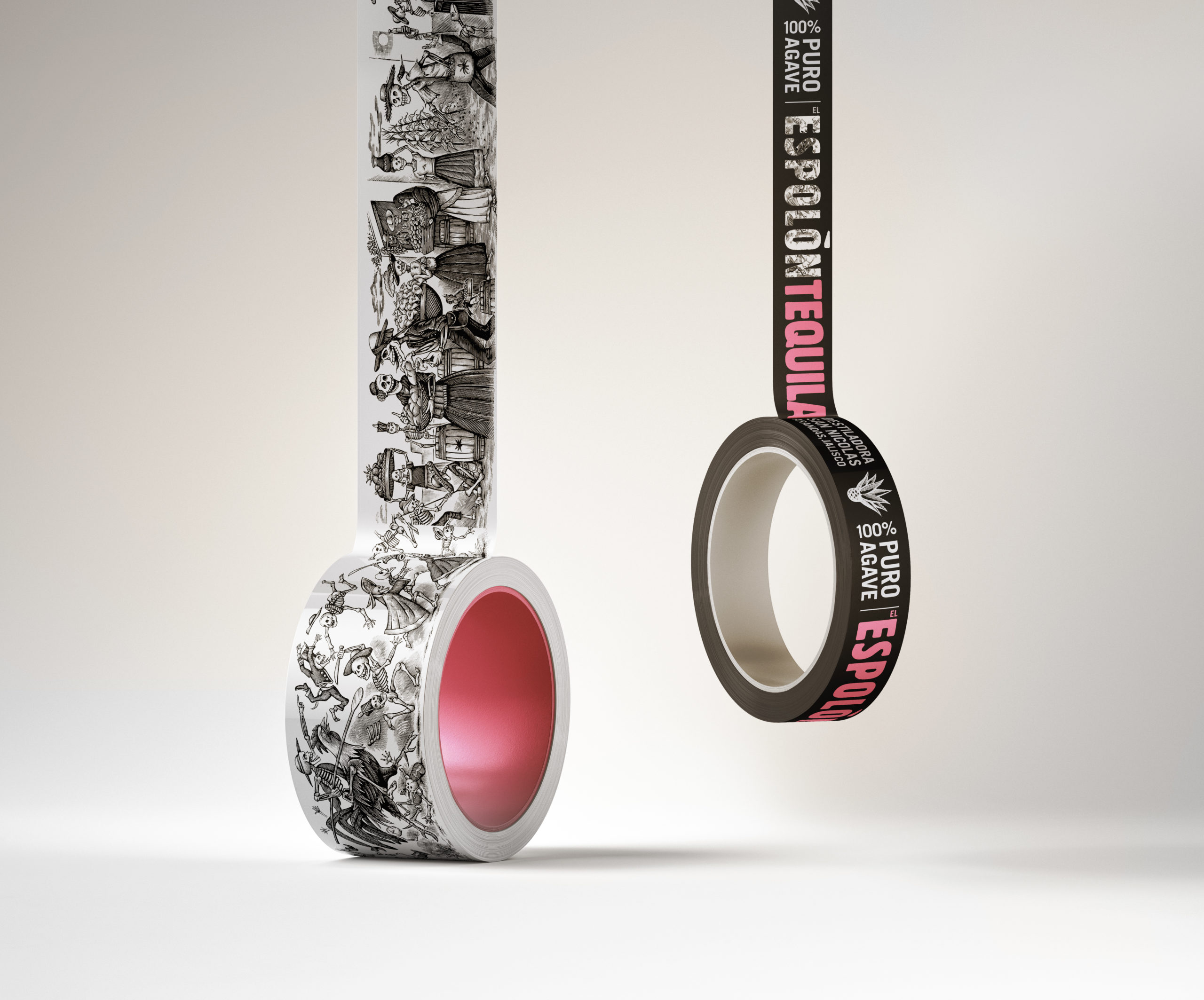
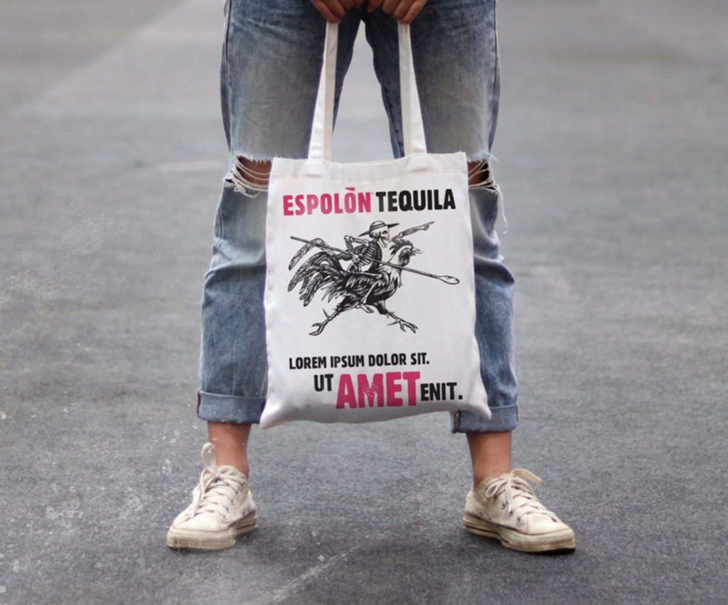
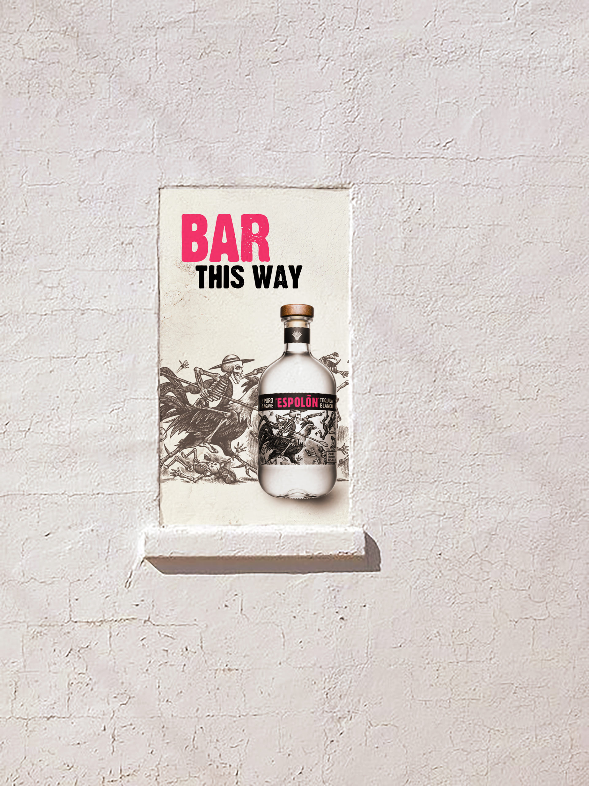
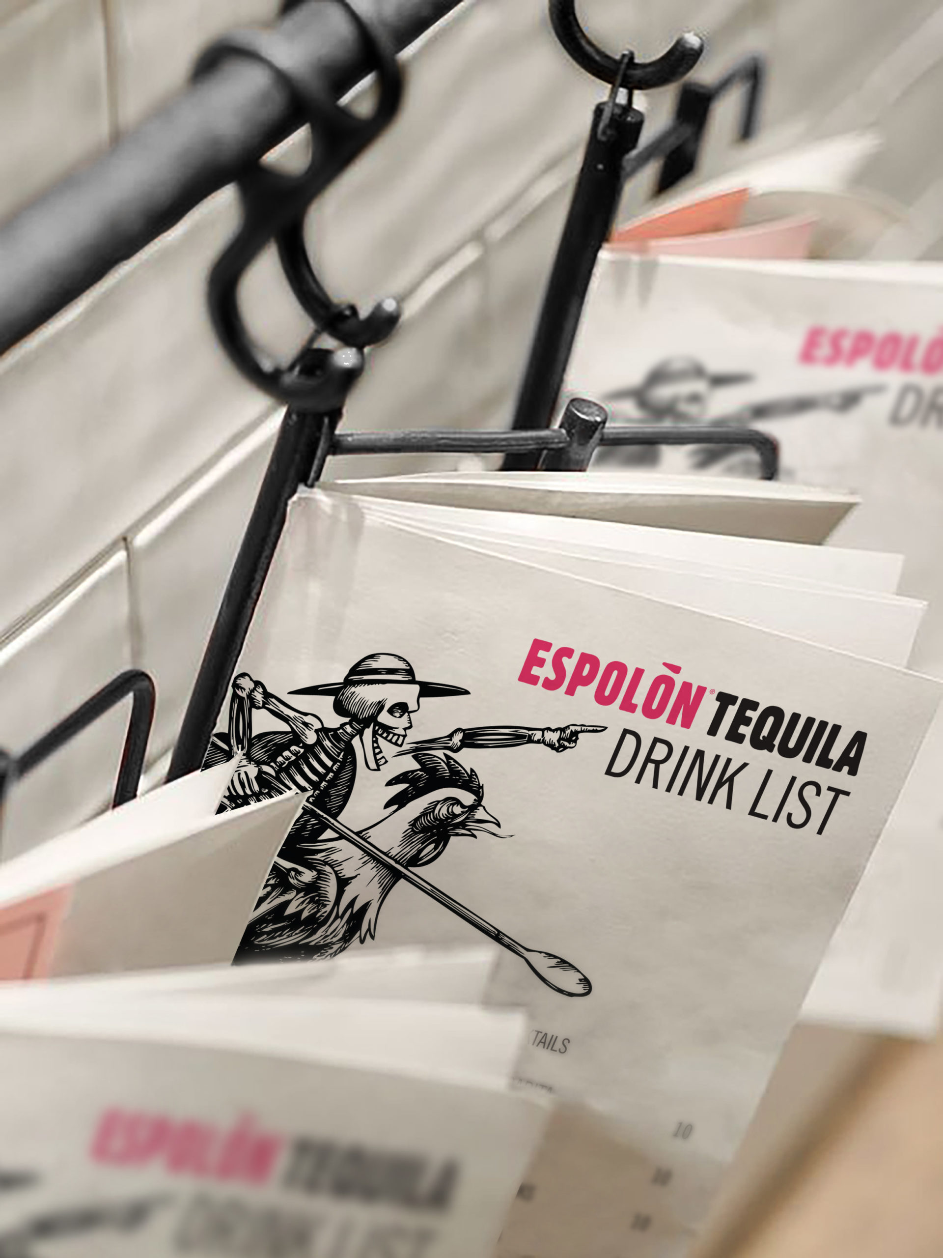
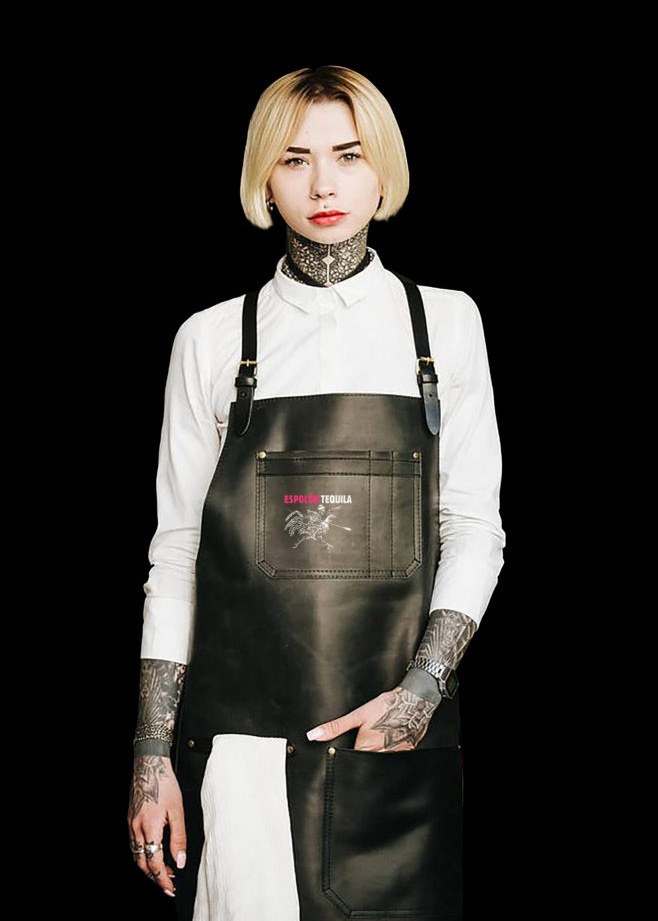
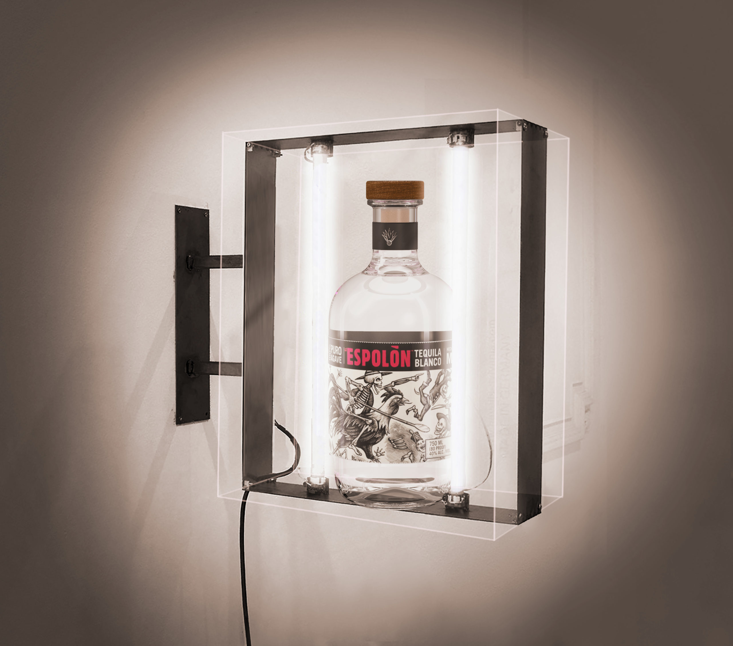
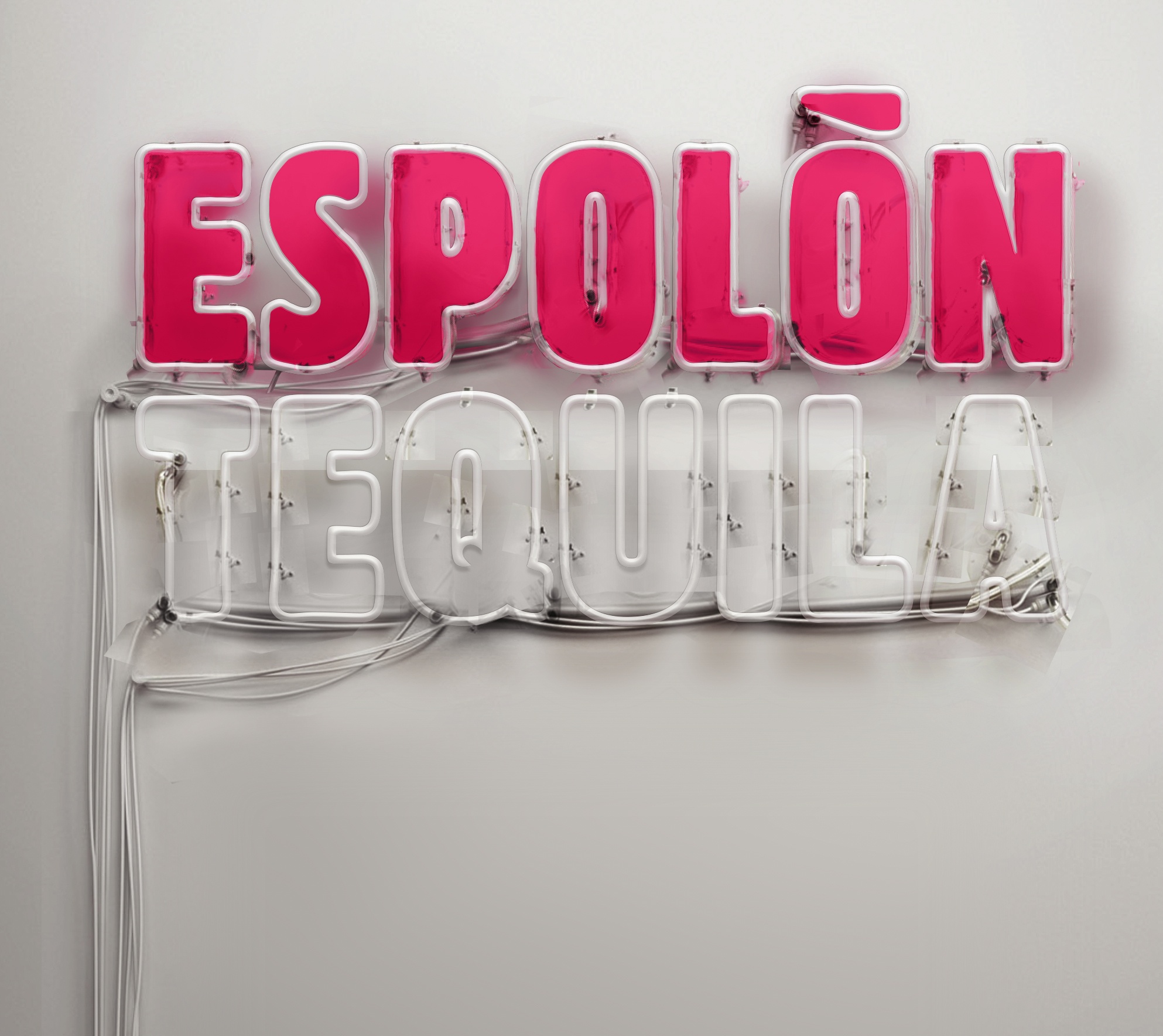
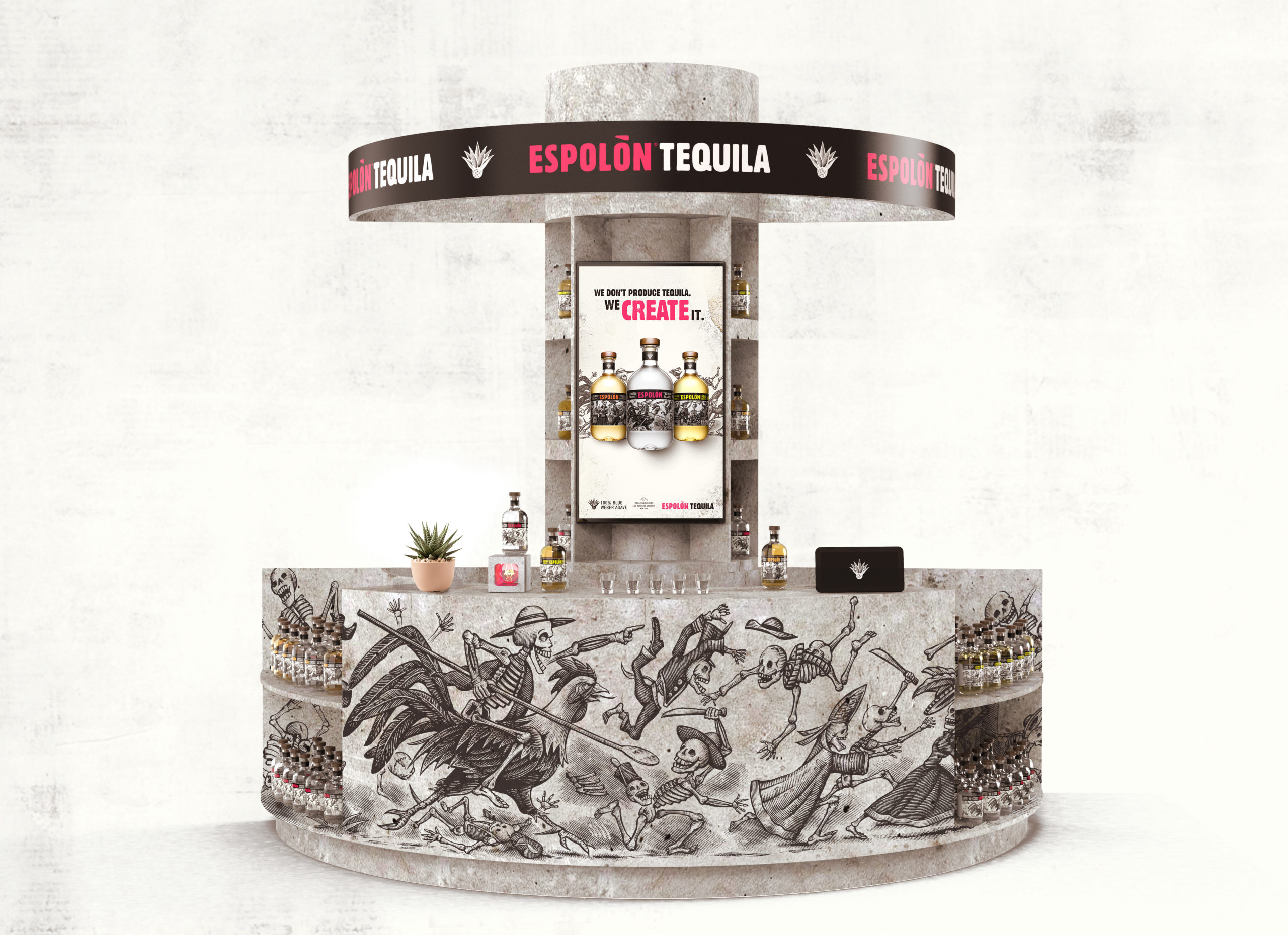
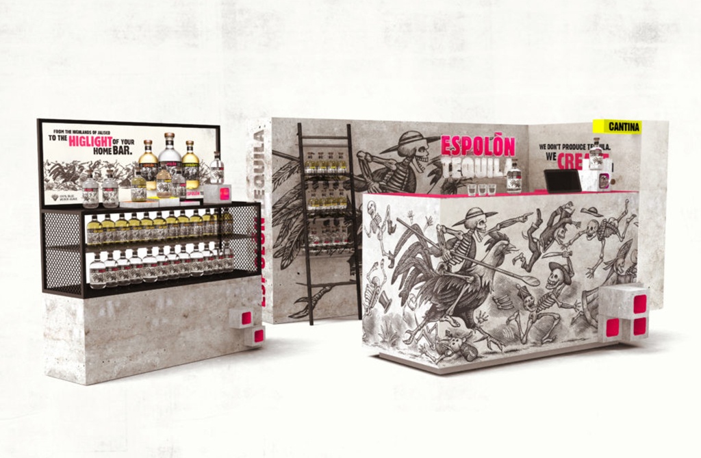
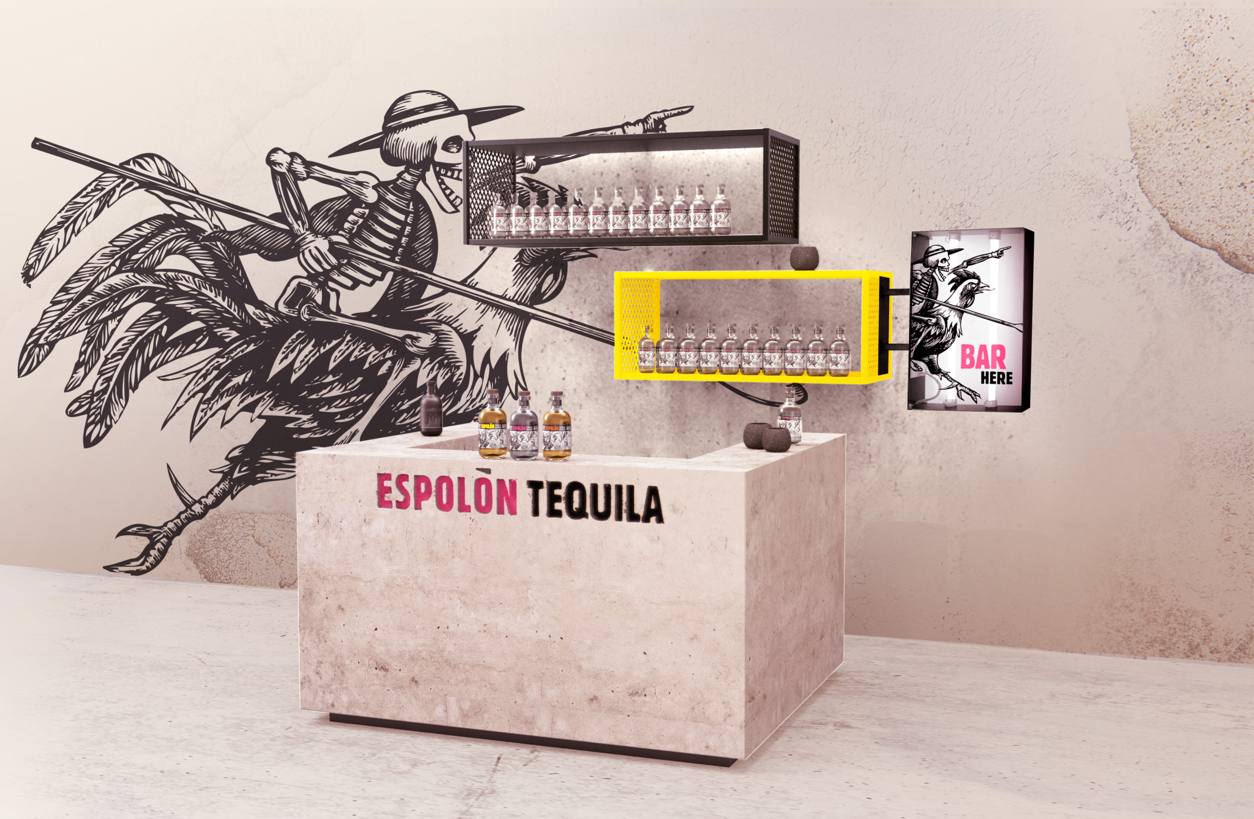
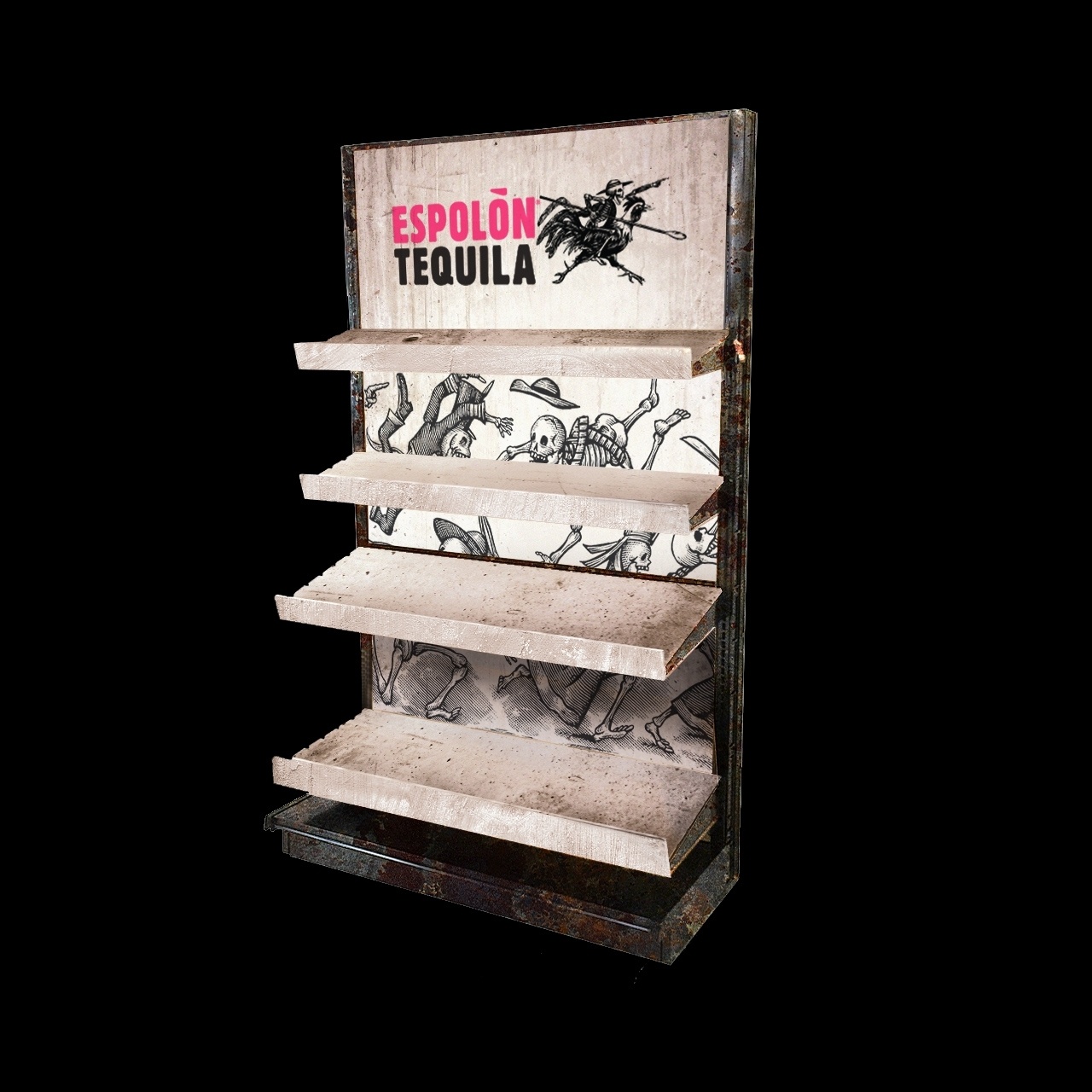
Our work was 360 and included: a new brand identity and logo, brand manifesto, design principles, art direction, photography, POSM development and the creation of campaign key visuals for outdoors, in store and digital. ⁠


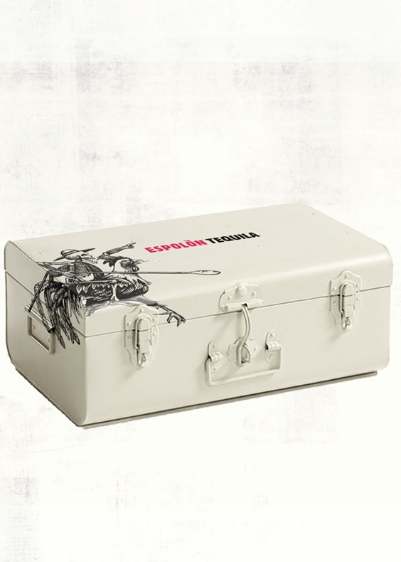
Brand world, Visual identity, Brand Manifesto,  Art direction, Photography, Key visuals (Print & Digital), Retail Assets.
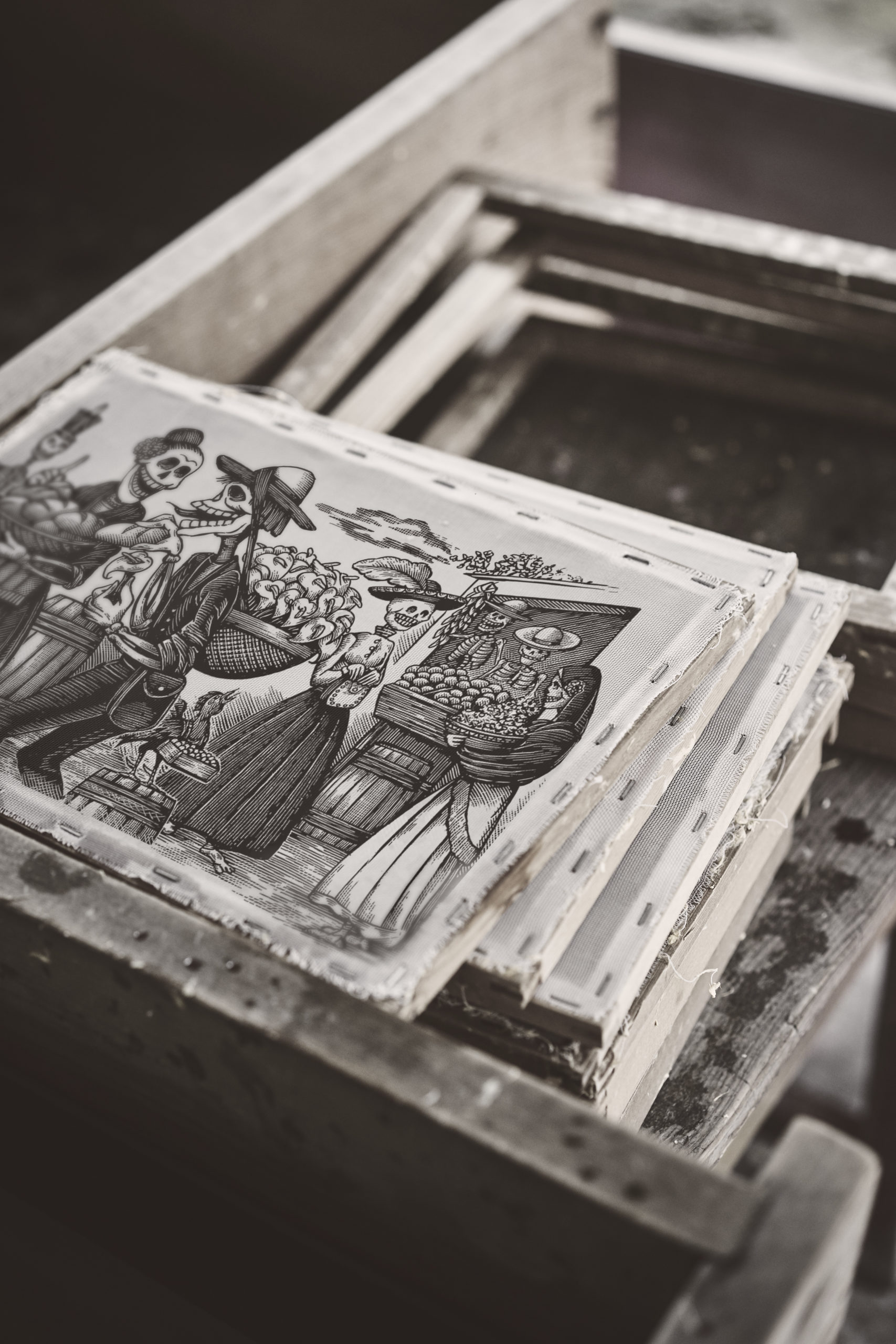
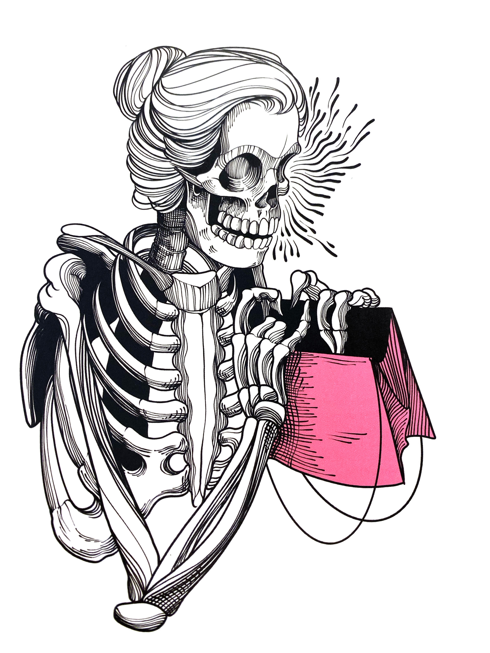
Each label tells a story from Mexico’s rich history. Each captures a different moment, but all pay tribute to one true hero – José Guadalupe Posada. Posada was a 19th century artist and printmaker, a real pioneer and a bit of a rebel. His most famous work, the calavera (skulls), made powerful commentary on the social injustices of his time. With his sharp wit and clever hand, he gave his people a voice, and gave the art world a style that continues to influence pop culture today.

Espolòn tequila is created, not produced. Our product is a beautiful alchemy of traditional, authentic Mexican excellence in craftsmanship, a hint of unpredictable imagination and a touch of contemporary Mexican street culture. Our enthusiasm to critique every detail of the journey defines who we are. Our backstage is the most authentic expression of our craft – this is the place where things get created. A platform dedicated to experimentation, nothing here is perfectly aligned. The atmosphere is intense, you can feel the energy of the mess. You sit on boxes, you write on the wall. It’s raw, unpolished and elemental. Behind each piece of perfection, there are always imperfections. Trials & failures. Being a creative brand is more than a verbal statement, it’s about walking the walk. We act. Espolòn tequila is the backstage where new talents meet the old ways. Together, we have more energy to create the next chapter of tequila.

     
We developed a style guide to provide a strategic approach to POS materials and global brand building. The goal of this document was to ensure a consistent and iconic brand image for Espolòn Tequila through shared designs, graphics and elements, allowing local markets to bring the brand to life. This document was also intended to support other available tools such as the Espolòn Tequila Brand Visual Identity.